
Search results
-

Brexit, for once some facts.
you mean like having cherries and eating them? I do that all the time. (I have a few cherry trees in my garden in France (variety Napoleon, pigeon's hearts), we collect bags of cherries in July).- Woosh
- Post #26,921
- Forum: General Chat
-
Brexit, for once some facts.
Found on Bloomberg this morning:- Woosh
- Post #26,912
- Forum: General Chat
-
Bike Purchase Advice - 22 Mile (one way) Commute
if you go for a 13AH battery and recharge often, you should consider Lithium Ion Phosphate battery. They weigh 25% more but can be charged twice as fast and have exceptionally long life. Kudos may have some stock with LiPO4 batteries.- Woosh
- Post #96
- Forum: Which E-Bike Should I Buy?
-
Bike Purchase Advice - 22 Mile (one way) Commute
good choice, Deno. the Bosch CX seems to offer the right balance between speed, power and battery usage. Shame that there is no such discipline when it comes to Chinese kits which tend to make people lazier in comparison and therefore require a bigger battery, putting a smaller limit on distance.- Woosh
- Post #93
- Forum: Which E-Bike Should I Buy?
-
A little lost and just a bit confused from Devon
Hello Eurydice, May I suggest you take a look at these two bikes? Woosh Petite: http://wooshbikes.co.uk/?petite Woosh Santana2: http://wooshbikes.co.uk/?santana2 The Petite, as you may have guessed by its name, is made for your height. It has everything a good bike should have, good Bafang...- Woosh
- Post #8
- Forum: Introduce Yourself!
-
Need help choosing a bike for 19 mile commute
Oh yes, sorry about the Predictor tool, I was fiddling with upgrading PHP to the current version this afternoon. It's now fixed and working. You enter your postcode then enter. The map then centers on that postcode, click where you want to go to on the map. Drag the path to where you want if the...- Woosh
- Post #17
- Forum: Which E-Bike Should I Buy?
-
Bike Purchase Advice - 22 Mile (one way) Commute
there are plenty of good reports on batteries from Kudos, Cyclezee, Juicy and Wisper to name a few. The thing that bugs me is Rob seems to paint all Chinese batteries and bikes with the same brush.- Woosh
- Post #86
- Forum: Which E-Bike Should I Buy?
-
Bike Purchase Advice - 22 Mile (one way) Commute
sorry to sound like a broken record, but do you have any proof to support such claim? I have examples of Chinese batteries that I sold in 2011 and still working.- Woosh
- Post #83
- Forum: Which E-Bike Should I Buy?
-
Need help choosing a bike for 19 mile commute
that's not hilly. Maximum gradient is only 5%. You can use my Predictor to give you a rough idea: http://wooshbikes.co.uk/clearway.php- Woosh
- Post #14
- Forum: Which E-Bike Should I Buy?
-
Bike Purchase Advice - 22 Mile (one way) Commute
pot, kettle. At least, I can substantiate my posts.- Woosh
- Post #80
- Forum: Which E-Bike Should I Buy?
-
Bike Purchase Advice - 22 Mile (one way) Commute
Rob, you don't own a recent Chinese bike and yet, you post every time to rubbish them. That's simply prejudice.- Woosh
- Post #78
- Forum: Which E-Bike Should I Buy?
-
Bike Purchase Advice - 22 Mile (one way) Commute
the cell manufacturers guarantee the minimum capacity within the working range. In the same way, I am practically certain that Bosch, Shimano and Yamaha set the working range to be at least capable of delivering what is promised on the label. They restrict what can be used to prolong the life of...- Woosh
- Post #76
- Forum: Which E-Bike Should I Buy?
-
Bike Purchase Advice - 22 Mile (one way) Commute
it's easy to prove by opening the casing. Cells specifications are published, you take the cell capacity in AmpHour, multiply by the number of cells in a row, hey presto.- Woosh
- Post #74
- Forum: Which E-Bike Should I Buy?
-
Bike Purchase Advice - 22 Mile (one way) Commute
do you realise that you are tarring all the Chinese e-bike importers here with the same brush? Have you got any proof that any battery that I, Kudos, Amp, Cyclotricity, Edge.Bike or Juicy sell (those present on here) gives less than what is labelled? Although you don't say that we do, but the...- Woosh
- Post #72
- Forum: Which E-Bike Should I Buy?
-
Brexit, for once some facts.
I wonder what this government is going to give more money to. The army or the NHS?- Woosh
- Post #26,862
- Forum: General Chat
-
Need help choosing a bike for 19 mile commute
you haven't seen any one of my bikes recently. Your friend Peter can probably confirm that GXP crankset, sub 2.2kg suspension fork, 9-speed Deore and hydraulic brakes are not fitted to cheap normal bikes, leave alone e-bikes. Check out these three, £1,000-£1,100...- Woosh
- Post #5
- Forum: Which E-Bike Should I Buy?
-
Need help choosing a bike for 19 mile commute
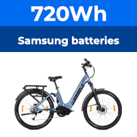
that is a gratuitous remarks, we use Samsung and Panasonic cells, same as you find in European made batteries. By the way, BMZ contacted me with regard to supplying me with their batteries as they claim they assemble batteries for Bosch and quite a few European brands, guess where. There is a...- Woosh
- Post #3
- Forum: Which E-Bike Should I Buy?
-
Brexit, for once some facts.
this chart shows better how we are doing (as percentage of GDP and compare our output against our rivals): UK plot is in dark gray, France did slightly worse than us up to the referendum then the Pound crashed, so the 2017 figure may show France's industrial output higher than ours. No wonder...- Woosh
- Post #26,848
- Forum: General Chat
-
Brexit, for once some facts.
most of us posting here can still do that, brexit changes practically nothing Foreign Companies Wanted. Plenty of incentives and state aids. Projects should start after brexit only. Flexible regulations a promise!- Woosh
- Post #26,840
- Forum: General Chat
-